Product Strategy:Financial Planning
Introduction
Creating a web-based experience for financial planners to help their clients understand and manage their personal finances, including banking, credit card accounts, and other assets not managed by the advisor.
I served as the design lead, engaging directly with the client stakeholders, internal product owner, and design team to shape the vision and execution of the experience. I worked closely with another designer on our team to shape the user interface and visual design direction.
Goal
The primary goal is reducing the number of administration, data collection, and customer service related phone calls, so the advisor can have more time to focus on planning and analysis services. The portal also helps advisors compete with robo-advisor products like Betterment or Mint. It will also enable them to engage with clients as they begin to build wealth and help them shape their financial future.
Challenges
There were several existing software products that needed to be integrated into the experience. Many of these had interactions that were explicitly defined by APIs, so the experience we created around those needed to work seamlessly with those. There was also a very detailed and established corporate style guide that our designs had to work within or compliment.
Primary Persona
"Maintainer"
Retired and established client who wants to monitor balances and market performance to make sure their investments are safe. They are less concerned with planning since they are actively using up retirement assets.
Activities
- Check balances
- Monitor returns
- Receive updates on market conditions
Pain Points
- Not tech savvy
- Only basic knowledge of finance
- Relies heavily on advisor
Opportunities
- Ample free time
- More focused goals
- Not worried about wealth accumulation
Theme: “How am I doing?”
Design Objectives
Enhance context
We want to provide an appropriate level of detail necessary for understanding factors affecting valuation without being confusing or overwhelming.
Establish comfort
The application should make the user feel that assets are being managed appropriately and securely.
Encourage truth
The advisor and the client need to be transparent with each other to have open and honest evaluations of personal expenses, progress toward financial goals, and asset performance.


UI Design and Concept
Through a strong collaboration with the client's design leadership team, we were able to create an interface that worked within their digital styleguide but presented a more consumer-friendly direction.
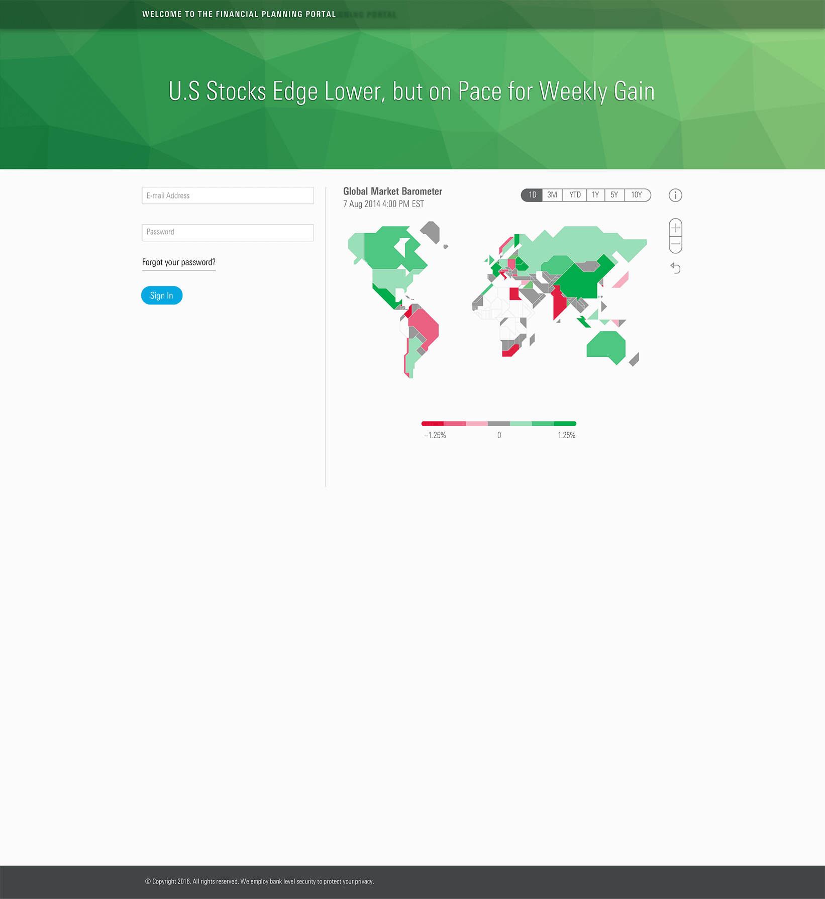
One of the key elements of the new design was to add market information on the sign in screen. This was in response to advisors wanting to reduce the calls from concerned clients every time the markets were down. We wanted to prime the user so that when they entered the portal, they would be prepared to understand the current state and expected trends of their net worth. If the global markets are down, one would expect that your net worth would be trending downward, so hopefully doesn't come as a shock when you sign in.
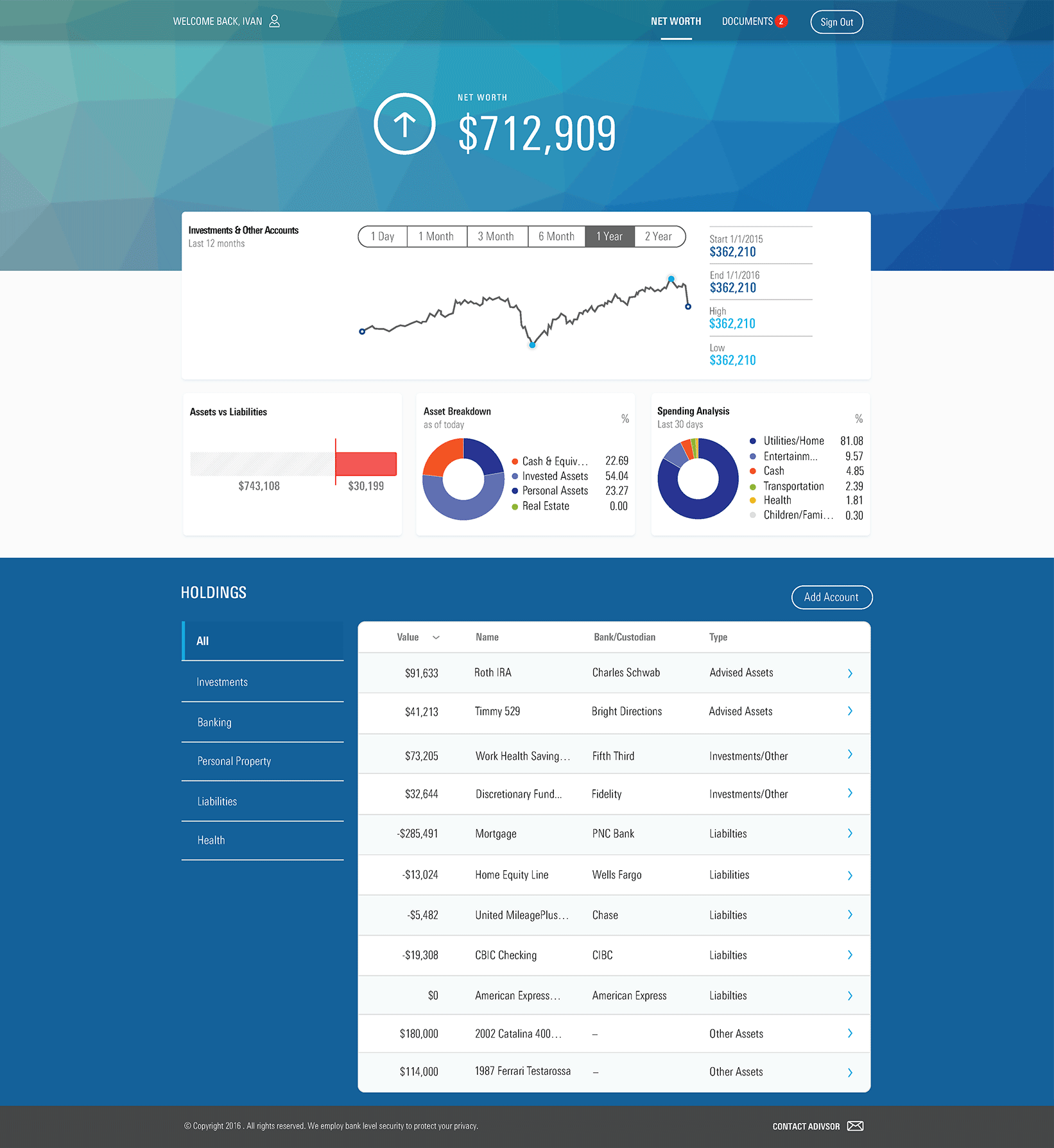
The landing page shows net worth as "the number" big and bold at the top, along with trend information. Financial advisors try to help clients understand that short term volatility is expected. Rash decisions can cause unrecoverable losses. With a proper plan and risk mitigation strategy, returns may be a smaller percentage but more reliable, especially over a longer period of time. Seeing current net worth and understanding how and where it is trending is key to consuming the big picture rather that what's happening immediately.
Testing
We created a clickthrough prototype with the final UI and presented it to end users for task-based usability evaluation.
Goals
- Feedback on organization and presentation of information
- Understanding of page content
- Understanding of graphs
- Feedback on amount and usefulness of information
- Expectations vs. delivery of relevant information
Feedback
- Users found the tool to be intuitive and well designed
- Aggregation of accounts and summary of asset allocation and spending analysis are very helpful
- Overall, users felt the tool is very valuable for managing finances at retirement
- Users would be comfortable sharing transaction information with their advisor, provided that the account numbers were hidden
- Depth of detail is appreciated
- Most users didn’t understand or find value in the “Portfolio vs. Benchmark Return” or “Portfolio Holding vs. Benchmark Risk/Reward” graphics
- More context is required to understand the “Market Barometer”