A Terribly Effective Experience
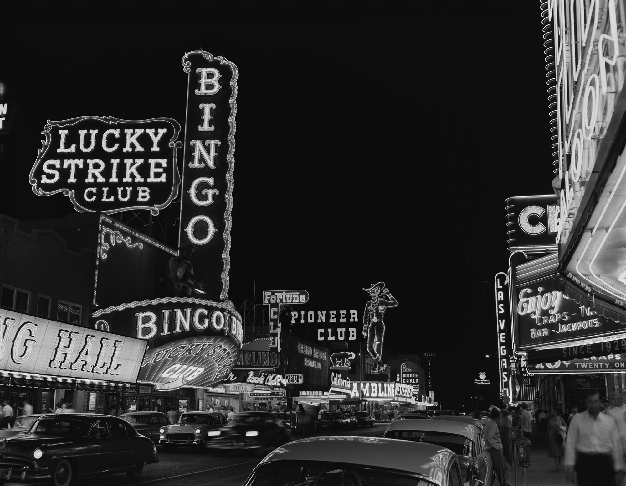
If you have ever visited fabulous Las Vegas, Nevada, you might have noticed that the sounds, the colors, the waves of stumbling drunken people, the loud carpet, the lack of clocks or windows, and the fake places both "real" fake and actually fake create a disorienting sense of chaos.
Sidewalks meander randomly through and around shops, bars, and restaurants. They lead you around some buildings and through others and over stairs and down stairs and inside and outside. The building across the street that you can see from your hotel room is impossible to find once you get to street level. There are no crosswalks that you can figure out. Apparently there is some sort of elevated tram system, but nobody knows where to board it, where it goes, or how much it is.
Inside the buildings, it's even more difficult to find your way around. Exits aren't marked. Signs have no direction arrows. Aisles and corridors intersect at odd angles and seem to come from and go nowhere. And even Indiana Jones couldn't find the toilets.
The entire place pretty much breaks every single rule of usability and by all theoretical models and measurables it is the worst possible user experience. In other words, it's perfect!
Every single aspect of your trip to the Las Vegas Strip is acutely choreographed to achieve a single, very specific goal: Sit down and spend as much money as you possibly can. Every design decision supports this goal. Every second you are in a casino and not gambling is instantly uncomfortable. It's dark. Aisles are narrow and crammed with people navigating the dizzying carpet and your hotel room is one of the moons of Mars.
In 2018, about 42 million people visited Las Vegas. How many of those people come home and complain about what a terrible experience they had?

A clear, simple, measurable goal is essential to crafting an ideal experience, and sometimes to achieve your goals you have to think differently or weirdly or go against what you might think is typical or expected behavior. Also, it's important to keep in mind that user goals are not the same as business goals. In this example, businesses in Las Vegas had a hypothesis that if people have fun (abstract user goal), they will spend money (concrete business goal), and it's been working.
Supporting abstract human needs through practical and measurable experiences is the true art of experience design. A basic agreement can be made between business and user and it's okay to nudge people toward the business goals as long as they are transparent and respectful. If everyone gets what they want out of the transaction, everyone will have a good experience - even if sometimes they can't remember it.