Case Study:Improving Forms
Results:
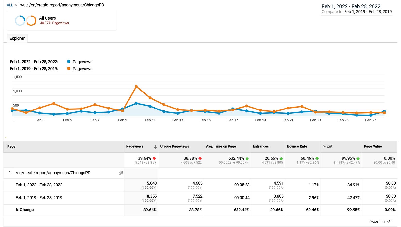
Average time spent sharing information
+600%
Number of phone calls
-43%
Bounce rate
-60%
Problem statement
Our anonymous crime tip forms aren't being used. The forms are abandoned at a high rate and we receive a large volume of phone calls from people who have problems using them. How might we increase usage of the forms?
Original Form

Usability analysis:
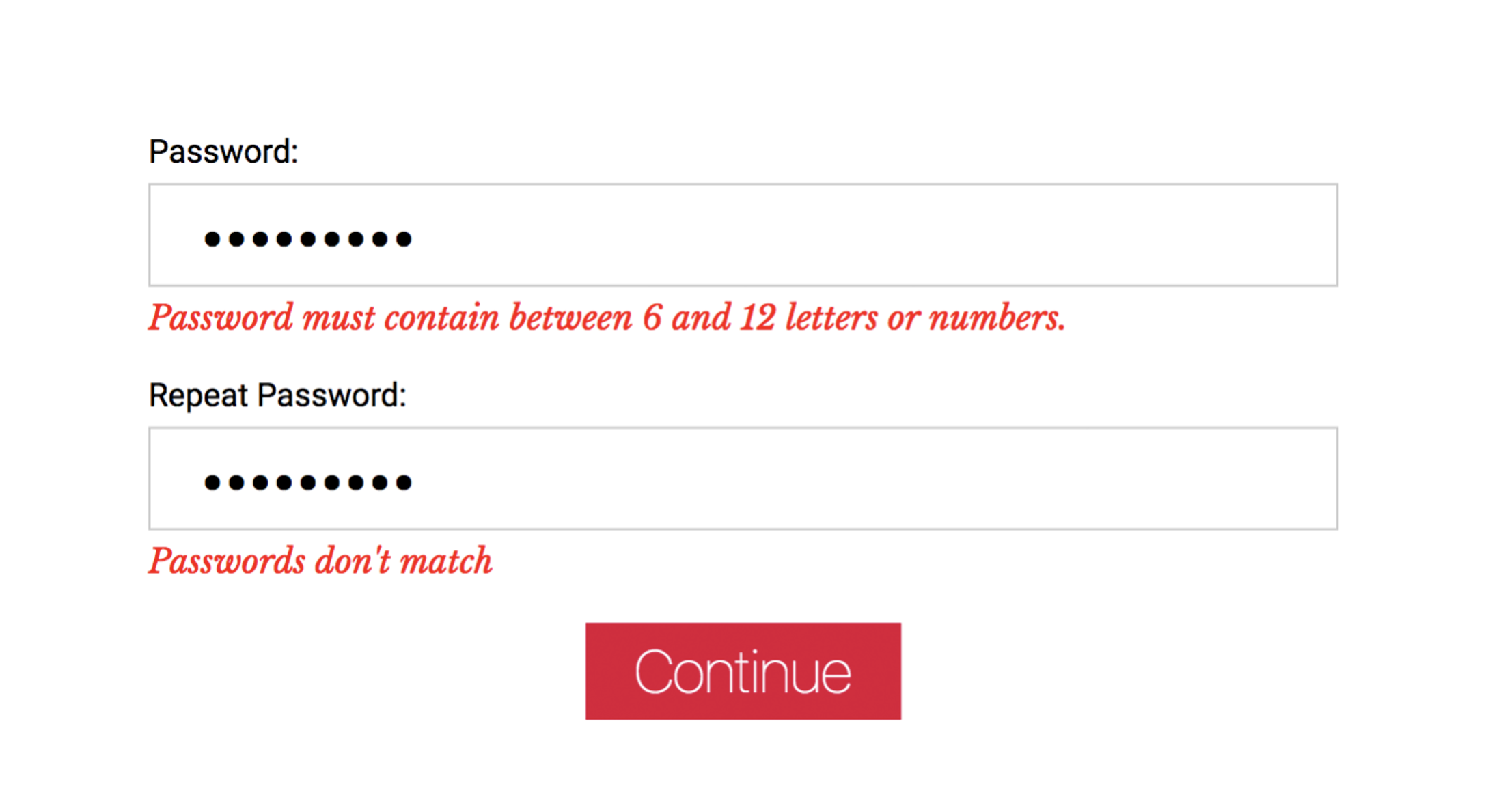
- It's incredibly long and intimidating - 146 fields but only 3 are required
- Language options are hidden in a dropdown with a label in English
- Rigid structure, requiring some basic understanding of police jargon
- This form was also used by people answering the phone, so they would have to hunt for where to put information as the person was talking to them
- Small font sizes
- Multiple fields on a single line
- Extraneous fields
- No instruction or help text
- No affordance for vague or colloquial input
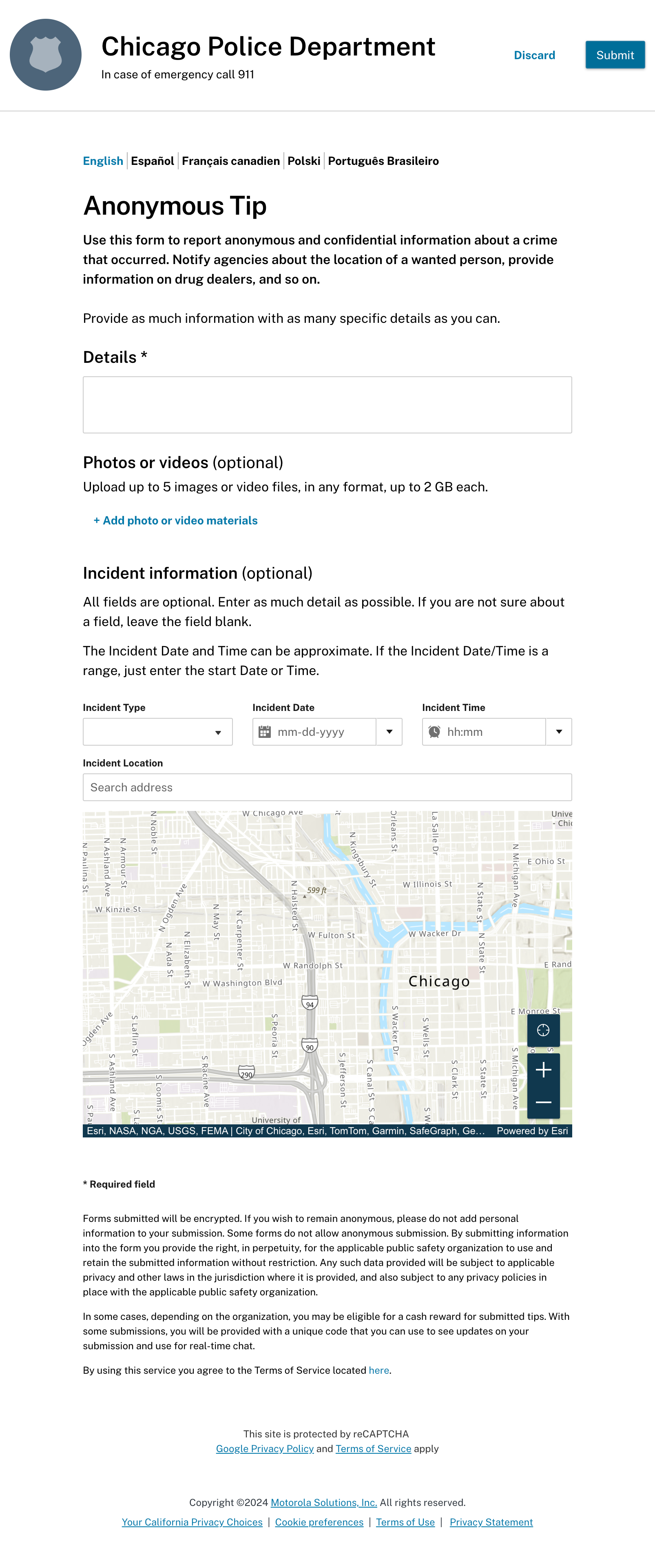
Updates
- One required field
- Free text input
- Clear language switcher
- Instructional text
- Geolocator for address validation
- Date and time picker controls
- Mobile responsive layout
- Modular design that can be reused for other types of forms (police report, etc.)
- Ability for speech-to-text input (not yet released)
The software used on the back-end to process the form was also updated. It enabled users to select text and add attributes to it. For example, if someone entered "The suspect lives at 555 Main Street", the user could highlight the text "555 Main Street" and flag it as the suspect's address. Future enhancements included AI processing that could recognized input in that format and structure and automatically flag it.
Google Analytics Report
Comparing year-over-year performance

How we got there

